10 Killer Features That Make Flyer Distribution More Effective With Flyer Examples
 by Shelly Parker
When it comes to effective marketing, flyers represent one of the best ways to reach your target audience, whether via the mail or in-store. However, it isn’t enough to simply produce a leaflet, distribute it, and hope for the best. Coming up with a strong design is vital. Without the right design, your leaflet could all-too-easily end up in the trash. With that in mind, coming up with great flyer ideas for business purposes couldn’t be more crucial.
The good news is that even simple flyer designs can be surprisingly effective in attracting the attention of the reader and persuading them to take action. So, here, we bring you our top ten tips for flyers that have all the killer features you need to ensure your leaflet distribution campaign is an outstanding success.
Top Tip 1 – Consider Your Leaflet Size
If you ask yourself “what does a informational flyer look like?” the chances are that your first thought will be of a compact leaflet that’s easy to store away in a bag or pocket. There are a couple of reasons for that.
Firstly, you need to ensure you’ve designed your flyer to meet locally accepted sizes. Not only do you need the printer to be able to accommodate your leaflet design, but also you may need to ensure your leaflet design is easy to post through recipients’ mailboxes without ripping or crumpling, and to stack on regular-sized display shelves. Although there’s a little more flexibility when it comes to design sizes if leaflets will be physically handed to recipients, transportation of the leaflets may still be a consideration. If they’ll be mailed to their display point, standard mail requirements must be met to avoid damaging the leaflets or incurring high postal fees.
Also, while a magazine or brochure-sized flyer may give you the chance to outline more key information and details about your business, many recipients find large leaflets quite off-putting. Since the whole idea of your campaign is to encourage readers to keep your flyer to hand so that they have your business details readily available, it makes sense to create flyer samples that are easy to handle and that are conveniently sized to keep safe.
In general, the best size for a flyer is a design that’s small but that packs a visual punch. A5 and A4 designs are often the best choices. A5 flyers can remain unfolded or be folded into a bi-fold leaflet, while A4 flyers are ideal for folding into a trifold or bi-fold leaflet.
Top Tip 2 – Experiment With Folds
When it comes to creative ideas for flyer template, the way you fold your leaflets could make a huge difference to your design. Simple trifolds and bifolds are effective, and accordion folds are also surprisingly satisfying! Alternatively, creating a flyer that can fold up into a compact square could be a great choice, or if you want to make your design super simple but impactful, folding one a single corner to create the effect of cut-out color is a bold and eye-catching option. Bear in mind, though, that even if you choose a design with unusual folds, it’s wise to create a design that can fold flat. That allows you to stack copies without any difficulties.
Top Tip 3 – Design With Your Folded-Out Layout In Mind
Flyer design is often very complex, particularly if you’re taking folds into account. While your promotional flyer example may look fantastic on screen in its 2D form, when it takes its folded form, it may appear somewhat lacklustre.
The best advertisement flyer examples keep both unfolded and folded versions of the leaflet design firmly in mind. While the leaflet’s folded design will need to be striking enough to attract the viewer’s attention, its unfolded design must be appealing enough to convert individuals into taking action.
You can use layout software to experiment with information flyer examples, marking the folds onto the folded-out leaflet so you can see how it will look in its final format. Bear in mind that the flyers information can be extended across the fold lines so the design when folded out will have an even more powerful impact. Images can be extended across several sections, while using color uniformly can bring the design when folded out together with a cohesive look. Alternatively, extending graphic patterns across the page creates an appealing visual flow through the folded sections.
The best folded flyer examples allow the visual elements like graphics, color, and images to extend across several folded sections, but the text should be kept in separate sections so the reader will be able to effortlessly read the content whether the design is partly or fully folded.
Top Tip 4 – Get The Right Balance Of Attention And Detail

Leaflets are typically marketing tools that are intended to make the reader aware of your brand, event, or product. Therefore, your design must be in line with this purpose. Remember that your leaflet has to be appealing enough to persuade individuals to pick it up and take it away so that they can peruse it later. Just as a magazine cover uses techniques to grab the viewer’s attention so that they pick it up, the best advertising flyer examples will draw the eye with a visually appealing front page. Your leaflet template’s front page should be like a sales pitch for your brand, achieving the ideal balance of detail and attention.
So, what do flyers look like when the balance of attention and detail is right?
Some effective attention-grabbing techniques to consider include using photographs of people who maintain the viewer’s eye contact, using a colourful corner or arrow that encourages the reader to open the leaflet, or a large-scale headline that uses a contrasting shade. You can then balance that attention-grabbing emphasis with more subtle interior sections which outline your offer in more detail. Essentially, when you get this balance right, your leaflet can serve dual function as a detailed brochure and advertising space in one limited space.
Top Tip 5 – Color Is Key
Often, leaflets must compete with countless others on a display shelf. So, the most successful marketing flyer examples will use techniques which ensure the template stands out. That’s where color comes into its own, both as a great way of catching the viewer’s eye and by creating a psychological effect in the viewer’s mind.
Bold, bright colours help to make your leaflet noticeable on a shelf, but you still need to choose your shades wisely. Warm colours such as orange and yellow are optimistic, vibrant, and welcoming, and as an added advantage, they are sometimes linked with alertness. But not all subjects are suitable for pairing with bright colours. In such cases, employing color contrasts can be equally as effective. A leaflet design that is almost entirely black with just a touch of white can create a dramatic and striking appearance. Contrasting geometric shapes make monochromatic designs more dynamic, while complementary color pairings like purple and yellow or orange and blue can instinctively make the viewer feel more inclined to accept your brand’s message.
Top Tip 6 – Proof The Type Size And Make Your Leaflet Simple To Read
If you’re planning to include multiple folds into your leaflet, it may be hard to tell if your readers are going to find the text legible enough to read with ease. It goes without saying that if your brand message cannot be easily read, your flyer is unlikely to achieve its goal of converting prospects into customers. So, you need to get the right balance of including all of the information you need to convey while still ensuring your text can be read.

Adding a lot of text to a limited space is an enormous challenge, but before you try to squash huge amounts of copy onto the chosen flyer design, you should first consider whether you can reduce the length of your text. Not only will this improve the leaflet template’s overall design, but it will also make your content far more accessible and legible for viewers.
All-too-often, accessibility is overlooked on printed media such as flyers. But if you size the text to a bigger scale (over 10pt) and use high-contrast colours (the easiest option to see is black text on a white background), users who are visually impaired will be better able to read your content. To maximise accessibility, consider included Braille, if possible, in your leaflet design, or, alternatively, create a standalone version in Braille.
While designing the leaflet with digital software, print off a hard copy that is the correct size. That will enable you to determine whether the text is properly sized for legibility. It will also allow you to check that the fonts you have chosen can easily be read. Although serifs look great for subheadings and headlines, geometric sans serif fonts are typically easier to read when font sizes are smaller.
Top Tip 7 – Offer The Recipient Something Real
Although it’s perfectly acceptable to send out a leaflet to tell people about your business, if you want them to respond, you should ensure they’ll get something out of it. You may decide to offer a discount coupon to encourage recipients to take action or give them something free with their purchase. You may even choose to give recipients something special if they stop into your premises or get in touch. Taking this approach will get recipients to pay closer attention and will make them more eager to find out about your brand. Everybody enjoys receiving something for nothing. Therefore, they’re far more likely to take your offer up.
Top Tip 8 – Set Up A Unique Contact Method
When you’re creating promotional leaflets, part of the marketing process involves analysing your level of success. After all, determining whether your flyers are doing the job that they were designed to do is essential to inform your future promotional campaigns. The best way to do this is to ensure you have set up a unique contact method that is solely associated with that leaflet or flyer. It may be a separate phone line, a unique web page, or an individual email address – whatever you choose, you’ll be able to identify when people have reached out due to receiving your leaflet rather than having been alerted to your presence by another of your marketing campaigns.
Top Tip 9 – Try Twinning Your Media
Flyer design is a highly effective advertising tool as it facilitates engagement with individuals who already have an interest in what you have to offer. As an example, somebody who is interested in local days out is likely to read a leaflet that outlines details of family events that will be taking place at the local museum.

Since leaflets are a very targeted marketing media format, including them within a broader advertising campaign is often a good idea. That means the leaflet itself shouldn’t have a standalone design. Consider your flyer design in conjunction with your other media types, for example, your app, website, signage, or posters. When you’re using leaflets within a wider marketing campaign, it’s important to consider how you’ll make these different media types work seamlessly together in order to ensure a highly cohesive campaign.
You can achieve this goal by using fonts, colours, and imagery that are similar across all of your related designs so that users can connect them all together with the brand or even that you’re advertising. Setting up a specific leaflet design brand style will also prove helpful in the long run if you’re going to be creating flyer designs again at some future time for similar offers or events. Creating a template for your leaflet using computer design software will enable you to return to your original design’s structure so that you can simply adjust the images or colours to give your next leaflet a completely different feel.
Top Tip 10 – Create A Special Keepsake
As space on your flyer may be at a premium, it’s often tempting to try crowding the layout with as much information and detail as possible. However, exercising restraint is always wise. Bear in mind that a flyer design is always most effective when it has some “white space”, or areas including only decorative graphics or background colours, or even absolutely nothing, since this helps direct the viewer towards essential points that they need to know.
Once the leaflet has been unfolded, viewers spend more of their time perusing the front, unfolded side. That means that this is the best location to outline all the key essentials such as product prices, event details, or QR codes where more information can be gleaned.
The reverse of the flyer is often a large space that can frequently be overlooked, yet it represents the chance to add something genuinely helpful for users, and that can turn a basic disposable leaflet into an item to be kept as a special keepsake.
For example, if your business is advertising a tourist attraction, an event, or hotel, the reverse of the flyer is an ideal spot to add a map, however there are many other things that can be included that will increase the useful lifespan of the leaflet. For example, a colour-in children’s activity, an event or restaurant offer, or even a calendar with events in the local area highlighted – all these can give a leaflet an additional lease of life far beyond its initial pick-up and will ensure your brand message remains with its intended market for longer.
Flyer Examples And Case Studies
How can you create an effective flyer example in practice? If you’re wondering how you can put into practice some of the flyer tips that we’ve suggested here, check out these industry examples that will help you visualise your design and see how to maximise the appeal of your leaflets.
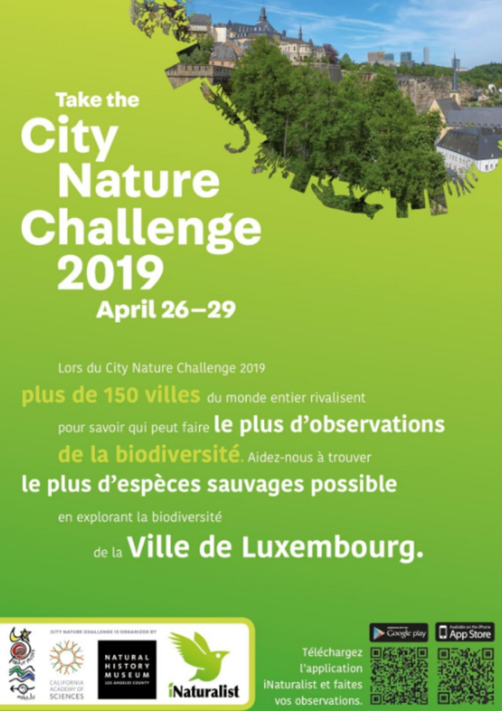
Let’s take a look at the above example. How has it used these flyer tips effectively?
- It has used contrasting fonts – white on a green background – to draw your eye to the most important points.
- An attractive and colourful image has been used in the corner of the leaflet to catch the viewer’s attention and to encourage them to unfold it and read more.
- QR codes have been added at the bottom so that readers can find out the information that they need to know without taking up too much space on the leaflet.
- There is plenty of “white space” on this leaflet, so it is visually appealing.
- The font is large enough to allow the reader to see it clearly.

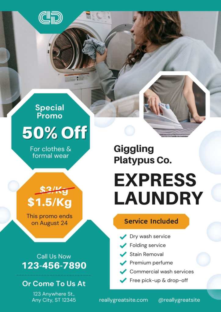
Here’s another good example.
- The use of bands of contrasting colours draws the viewer’s eye to the key points of the brand’s advertising message.
- There is a unique telephone number included at the bottom of the leaflet to encourage the reader to take action and get their free quote.
- The use of images makes it clear what kind of services this business offers before the recipient even reads any of the content.
- The font is clear and easy to read.

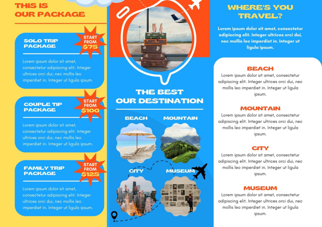
Let’s take a look at this more complex leaflet.
- There’s a lot of content here, but thanks to the tri-fold design and the way that the text has been focused into separate columns within each fold, it doesn’t look confusing or cluttered.
- The colourful images and diagrams help to draw the eye and spark the reader’s interest.
- The graphics that extend across the folds bring a cohesive look to the whole leaflet and encourage the viewer to unfold the document to see more.
This leaflet is an excellent example of how a business can offer its target audience something real to encourage the recipient to take action. By offering a discount coupon on this flyer, this business is more likely to encourage viewers to convert from a prospect into a paying customer.
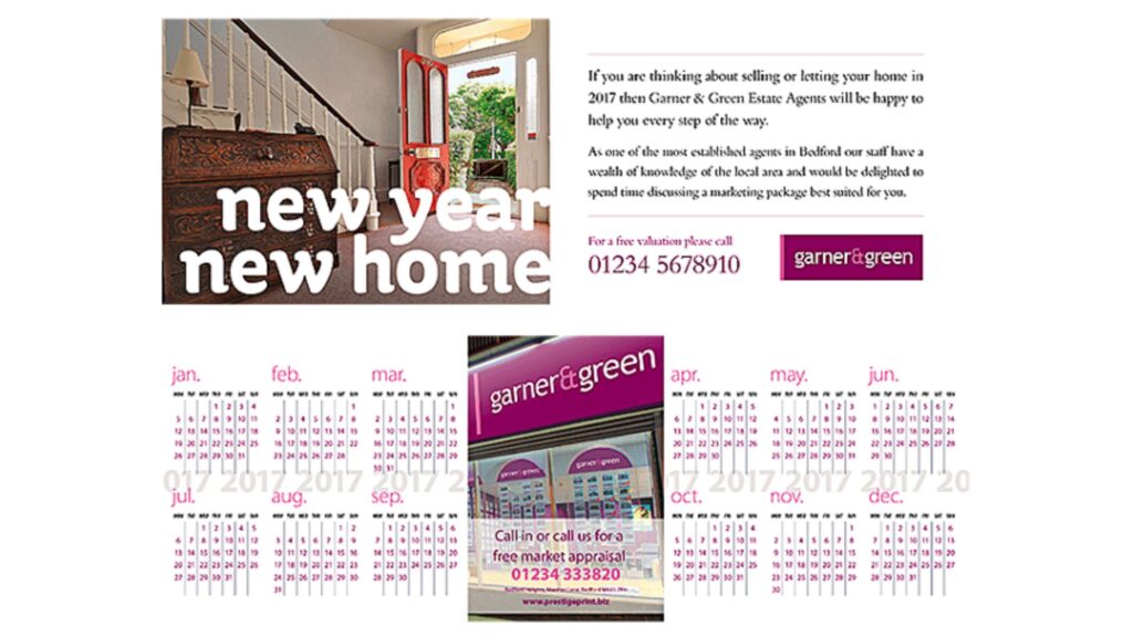
The above leaflet shows clearly how a simple design can be highly effective. Its designers have thought carefully about how the flyer looks when folded and unfolded and have created a leaflet that folds down into a compact and easily storable size. When the leaflet is unfolded, it contains a very basic map that outlines important areas of interest, along with colour-coded sections that stand out clearly so that the view can find the details that they need at a glance.
Here’s one more interesting and eye-catching leaflet design that incorporates many of our top tips to ensure maximum effectiveness. They include:
- An eye-catching image at the top of the leaflet to attract the attention of the viewer.
- Easy to read fonts against contrasting backgrounds.
- Unique phone numbers to allow the business to analyse the effectiveness of their flyer campaign.
- An integrated calendar to ensure this flyer has a lifespan far beyond its original usefulness.
- A clear brand logo so that the recipient can see at a glance which business this leaflet is advertising.
These industry examples show clearly how our top tips to help you create the most effective marketing flyer examples can work in practice. If you incorporate some or all of them into the next leaflet design for your business, you can maximise the success of your advertising campaign.
So, What Makes An Effective Flyer Design?
As you can see, there is a lot that goes into creating a highly effective flyer design. Using bold and contrasting colours, selecting immersive and appealing images that cross folded sections, and choosing the correct fonts to improve legibility all have a role to play in ensuring your leaflet template creates the maximum visual impact.
For your flyer to achieve its goals, it needs to not only be eye-catching but also highly informative. Getting the optimal balance of aesthetic appeal and key details lies at the heart of a successful leaflet campaign. If you follow the flyer examples that we’ve outlined here, you’ll have the best possible chance of reaching your target audience and achieving your marketing goals.